Friday, 20 May 2011

trains, planes and automobiles.......... i mean t-shirts, cards and badges!

Diet, because you're fat white t-shirt that i screen printed,
with some nicely pressed creases :s


My beautiful assistant Katey with one of the baby grows Diet, because you're fat.
Supposed to be funny/harsh/ironic as well as commenting on messages on body image starting younger and younger.

Close-up of the design (with one of Katey's dreddies). I wanted the font similar to the one i found in a diet coke advert so it looked real. I wanted it to be quite subtle, though the larger 'diet' does forewarn some sort of play on the brand. I choose white and grey t-shirts because they are classic and the colours of the can- i did contemplate using red, or red on the 'because you're fat' line but thought it would look too harsh aesthetically.

XS size (from good old Primark!)


I want some McLovin' t-shirt. Black on white because I like the strong icon of it. Has zine, low-fi quality I like as well. On Tuesday i'm going back to screen room and will try pink and purple on white as well as black on coloured t-shirts :)


My Valentine's cards packaged. I think they reflect my style and humour.


A close-up of my 35mm badges with 8 different designs.


The set of six, four badges in each.

My business cards.


viable ovaries/ it's poison concertina books

I have the images from this project on this blog somewhere but when i borrowed my friend Katey's SLR camera today i went a bit mad whilst i had the chance to photograph work! See it in it's 3D concertina standing up glory!


Side 1 on A Handmaid's Tale and women's roles in the books as well as current media

Side 2- I like the repetition and zoom-in of the front cover on the first
image. Like the ominous quote in the triptych at the end too.


Soma side 1- looking at soma-like drugs in our life like fast food,
television, religion and alcohol


Side 2- predominately letterpress which was tricky but really fun and
has unique, messy results


The cover slip in the middle of the two books, front facing


The back of the cover slip with the two concertinas, back pages

'A Gramme is better than a damn!'

Studio 110, Roland Levinsky, Plymouth

My Studio space in University- i'm always shuffling around the work pinned up and swopping it. Usually just cut n' paste stuff i like. Its a bit neater then normal as i'm slowly trying to remove mags, books and work before we tear it down for our final exhibition.


voulez-vous coucher avec moi (ce soir) HnM shoe and little brown bag Primark bag :)

Some viable ovaries, diet and but
darling! the carrots are boiling work

Saturday, 14 May 2011

love, love is a verb

Here is (pretty much) the final designs for my valentines cards (i'm aware this important holiday passed a while ago- it's for my final brief) with a couple 'maybes'. Some of the designs, like the 'love' fist and mclovin' work in and on different colours.


Man muscle!
LOVE, this obviously centred on the card!


........smile! (is what's printed inside the card :)


Mclovin' collaged onto a semi-nude Lily Donaldson

Mr. Pink


'I have viable ovaries', this design has proven popular with people!


The massive attack lyric on a gucci perfume advert. The electric tape covers the brand name but also lends itself to the embrace and connotations.

The Rolling Stones


Bieber fever never runs out


Only just re-found and added this, i like the painterly vibe and collage

I think the illustrations are an eclectic mix but have my style at the forefront of each so they work as a series that is linked by cut-out type, print and collage.

ps. can you tell my theme's pop culture.

12:51 (i mean more like 22:10)

Just a couple things, printers are the evil, temperamental, expensive bane of my life!......But i really like this mistake that happened: classic image overlay but the juxtaposition between pink screen-print and grainy black and white print works, as well as the 'I like your Mclovin' tagline that comes out of the combined type.


.......the world weeps :'(

lol an old illustration where i cut out the 'position of the week' (lovely) from a girls mag. and as the female doll was brunette it gave me the idea for 'Ken Cheats on Barbie', i think it would make a good t-shirt!

Sunday, 8 May 2011

would you risk it for a chocolate biscuit

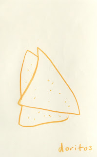
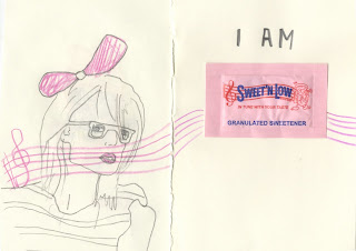
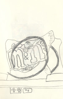
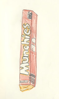
Similar vain to my night out/ drinking work, except this is looking at vending machines and their contents, with the different brands and connotations. Will edit, improve and make into perfect bound book too.


....munch! nom nom nom


We all know kettle 'chips' are, but still love them!